Typography is a silent ambassador for any brand, shaping perception and enhancing usability. For LinkedIn, the choice of font is more than an aesthetic decision—it reflects professionalism, accessibility, and modernity. If you’ve ever wondered which font LinkedIn uses, understanding it is key to replicating a polished, coherent visual identity for your professional presence.
LinkedIn combines a bold, recognizable typeface for its logo with clean, legible fonts for profile pages and content. This balance allows users to focus on information while maintaining the platform’s authoritative image. In this guide, we explore LinkedIn’s font choices, how they evolved over time, and practical ways you can apply similar typography principles to your LinkedIn profile or branding.
By the end of this article, you will understand the fonts LinkedIn uses, why they were chosen, and how they contribute to readability, consistency, and brand trust. You’ll also discover tips for using fonts effectively in profile banners, summaries, headlines, and other visual elements.
What Font Does LinkedIn Use?
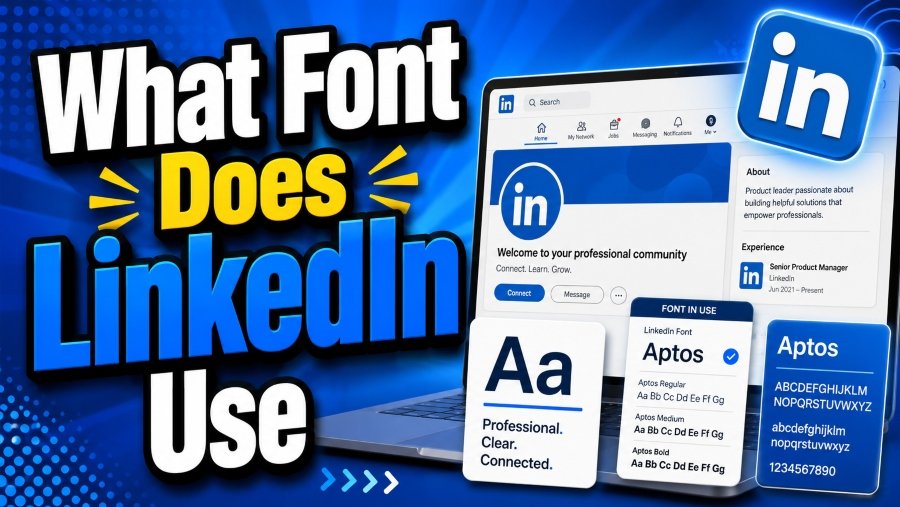
LinkedIn uses Avenir Black for its logo to convey modernity and professionalism, while Arial and Helvetica Neue are applied across the platform for body text and interface elements. These choices enhance clarity, consistency, and accessibility for users on any device.
LinkedIn’s Core Font Choices
LinkedIn’s logo has undergone a typographic evolution over the years. Initially, the platform used Myriad Pro, a humanist sans-serif font known for its approachable style. As LinkedIn matured, the need for a bolder, more professional typeface became apparent. In 2012, LinkedIn adopted Avenir Black for its logo. This geometric sans-serif font conveys modernity, confidence, and clarity, making it ideal for a global professional audience.
The geometric structure of Avenir Black keeps the logo legible across various sizes and media, from mobile screens to print marketing materials. Its bold lines suggest stability, professionalism, and sophistication, all qualities LinkedIn seeks to communicate to users. Choosing a font like Avenir Black signals authority while maintaining a contemporary aesthetic that resonates with professionals.
For on-site content and user profiles, LinkedIn prioritizes readability and accessibility. Arial and Helvetica Neue dominate these areas, providing clean, neutral, and highly legible text. These fonts work across devices, screen resolutions, and international languages, ensuring a consistent user experience.
Understanding what font does LinkedIn use helps designers and professionals create branding and materials that complement the platform. Whether designing a LinkedIn banner, creating mockups, or formatting personal content, using similar fonts or styles ensures visual coherence.
Moreover, the combination of Avenir Black with Arial and Helvetica Neue demonstrates how LinkedIn balances visual hierarchy with accessibility. The logo demands attention, while body text remains understated but readable. This distinction is vital for a platform designed for networking, professional communication, and career development.
Finally, the deliberate choice of fonts reflects LinkedIn’s commitment to a professional and modern look. Each font serves a purpose: Avenir Black provides identity and recognition, while Arial and Helvetica Neue enhance usability and reading comfort. Together, these fonts define LinkedIn’s typographic personality, shaping user experience and brand perception.
LinkedIn Font Application Across Sections
LinkedIn carefully applies its fonts throughout the platform to ensure readability, consistency, and a professional appearance.
Logo & Branding
Avenir Black takes center stage in the LinkedIn logo, creating a bold and recognizable visual identity that conveys confidence and professionalism.
Headlines & Buttons
Helvetica Neue is used for menus, headings, and call-to-action buttons, enhancing clarity and establishing a clear visual hierarchy.
Body & Profile Text
Arial and Helvetica Neue are employed for posts, summaries, and profile details, ensuring text is easy to read on desktops, tablets, and mobile devices.
Mobile Responsiveness
All fonts adapt smoothly to different screen sizes, maintaining legibility and a clean appearance across mobile and desktop platforms.
Accessibility
Fonts support international characters and consistent spacing, making the platform accessible and user-friendly for a global audience.
Why LinkedIn Chose Its Fonts
LinkedIn’s font strategy aligns with its professional ethos. Key considerations include:
- Professionalism: Sans-serif fonts like Avenir Black, Helvetica Neue, and Arial project a modern, credible look.
- Legibility: Clean fonts ensure that content is readable across screen sizes.
- Consistency: Using complementary fonts preserves a cohesive visual hierarchy.
- Trust & Stability: Bold, structured fonts convey reliability to users navigating career-focused content.
- Global Accessibility: Fonts support multiple languages and screen types, enhancing inclusivity.
Best Fonts for LinkedIn Profiles
While LinkedIn does not allow custom fonts in text fields, visual elements such as banners, images, and presentations can utilize professional typefaces. Recommended fonts include:
- Calibri: Clean and modern, ideal for body text.
- Arial: Timeless, widely legible, and professional.
- Helvetica: Sleek, sharp, suitable for headings.
- Lato: Friendly yet professional, great for summaries.
- Roboto: Digital-first, versatile for online displays.
- Open Sans: Balanced, readable across devices.
- Verdana: Optimized for screens, excellent clarity.
- Georgia: Serif option for elegant, authoritative sections.
- Tahoma: Clean, well-spaced, highly readable.
- Proxima Nova: Contemporary, rounded edges, polished look.
Tips for applying fonts:
- Maintain Hierarchy: Use bold or larger weights for headings, regular for body text.
- Optimize for Mobile: Keep line spacing and font size readable on smaller screens.
- Visual Contrast: Ensure clear separation between headings and body content.
- Consistency: Stick to 1–2 fonts across your design to avoid visual clutter.
- Highlight Key Sections: Use subtle variations, such as italics or small caps, in banners or visuals.
Font Tips & Best Practices for LinkedIn
Formatting Guidelines
- Use bold and italics sparingly for emphasis.
- Keep paragraphs short and scannable (2–3 sentences per line).
- Use bullet points and line breaks to enhance readability.
- Include white space in banners and visuals.
Device Compatibility
- Test font appearance across desktop, mobile, and tablet.
- Avoid overly decorative fonts that reduce legibility.
- Ensure text is clear even on high-resolution displays.
Accessibility & Professionalism
- Stick to fonts recognized for readability (sans-serif recommended).
- Maintain a clear hierarchy between headings and body text.
- Ensure global accessibility by using fonts that support multiple languages.
Conclusion
Understanding what font does LinkedIn use goes beyond curiosity; it is essential for designing professional and readable profiles. Avenir Black defines LinkedIn’s logo with strength and modernity, while Arial and Helvetica Neue provide clarity and usability across the platform. By following these typographic principles, you can create LinkedIn profiles, banners, and visuals that project professionalism, readability, and trustworthiness, echoing LinkedIn’s own branding success.
FAQ’s
What font does LinkedIn use for its logo?
LinkedIn uses Avenir Black, a bold geometric sans-serif font, for its logo.
Which fonts appear in LinkedIn profiles?
Arial and Helvetica Neue are used throughout profile pages and posts.
Can I use these fonts in my LinkedIn banners?
Yes, you can incorporate these fonts into banner images for visual consistency.
Are LinkedIn fonts mobile-friendly?
Yes, the fonts scale well and remain legible on mobile, tablet, and desktop devices.
Why does LinkedIn prefer sans-serif fonts?
Sans-serif fonts are clean, modern, highly legible, and convey professionalism.
What are alternative fonts for LinkedIn visuals?
Calibri, Lato, Roboto, Open Sans, Verdana, Georgia, Tahoma, and Proxima Nova are all excellent options.