How to change font color in html is one of the first styling skills you should learn when building or editing a web page. Text color helps you guide attention, improve readability, match your brand, and make important messages stand out without changing the structure of your content.
The best modern method is CSS, not the outdated HTML font tag. In this guide, you will learn the clean ways to change text color, choose proper color values, avoid beginner mistakes, and write code that works well on real websites.
Why Text Color Matters In HTML
Text color is more than decoration because it affects how quickly readers understand your page. When you use color well, you can highlight warnings, separate headings from body text, support your brand style, and make long content easier to scan.
In HTML, the content itself should stay focused on structure, while CSS should control how that content looks. This separation helps you keep your code cleaner and makes future design changes easier, especially when your website grows beyond one page.
Color also plays a role in trust and readability. A paragraph written in pale gray on a white background may look soft, but it can frustrate readers who need clear contrast to understand the page.
You should think about font color, font size, and font style as one design system. A design tool can help when you want to generate unique and stunning fonts for your projects before choosing colors that match your page, and pairing the right font with the right shade can make your content feel more polished and intentional.
Good font color choices help users know what matters first. For example, you may use dark text for normal reading, a stronger accent color for call-to-action text, and red only when something needs attention.
How To Change Font Color In HTML With CSS
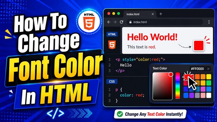
How to change font color in HTML is easiest when you use the CSS color property. The color property tells the browser what color the text inside an element should display.
The simplest example uses inline CSS directly inside an HTML tag. This is useful when you want to test a quick change or style one single element.
<p style=”color: blue;”>This paragraph is blue.</p>
In this example, the paragraph stays normal HTML content, while the style attribute adds a CSS rule. The property is color, and the value is blue.
You can also use other color values instead of a simple name. CSS supports named colors, HEX codes, RGB values, and HSL values, so you can choose between beginner-friendly and more precise options.
<h2 style=”color: #1a73e8;”>This heading uses a HEX color.</h2>
Inline CSS is easy, but it is not always the best long-term choice. If you repeat the same color on many headings, editing each line later becomes slow and messy.
That is why you should understand three common methods. You can use inline CSS for quick styling, internal CSS for one page, and external CSS for a complete website.
Use Inline CSS For Quick One-Time Styling
Inline CSS means you place the CSS rule inside the exact HTML element you want to style. This is the fastest way to change text color because you do not need to create a separate CSS file.
Here is a simple example:
<p style=”color: green;”>Your account has been created successfully.</p>
This works well for short tests, email templates, simple demos, or one-time styling. It also helps beginners understand how the CSS color property affects a specific element.
However, inline CSS becomes difficult to manage on larger pages. If you add the same color to twenty paragraphs and later want a different shade, you must update twenty separate places.
Inline styling can also make your HTML look crowded. Clean code matters because future edits become easier when structure and style are not mixed too heavily.
Typography choices are often shaped by popular platforms and their visual habits. When studying interface readability, a page about what font does chatgpt use can help readers understand how modern digital products use simple, readable type choices, and that same lesson applies when you choose clean text colors for your own HTML page.
Use inline CSS when speed matters more than scale. For a professional website, you should usually move repeated text-color rules into internal or external CSS.
Use Internal CSS For Styling One Page
Internal CSS means you write CSS inside a <style> tag, usually placed in the <head> section of the HTML document. This method is cleaner than inline CSS because you can style multiple elements from one place.
Here is an example:
<!DOCTYPE html>
<html>
<head>
<style>
h1 {
color: navy;
}
p {
color: #333333;
}
</style>
</head>
<body>
<h1>Welcome To My Website</h1>
<p>This paragraph uses a dark gray color.</p>
</body>
</html>
In this example, every h1 becomes navy, and every paragraph becomes dark gray. You only write the rule once, which makes the page easier to maintain.
Internal CSS is a smart choice for single-page projects, landing pages, coding practice, and small examples. It keeps your styling organized without requiring a separate stylesheet.
Still, internal CSS has limits. If your website has ten pages, copying the same CSS into every page creates repeated code.
Brand examples can also help you understand why typography and color must work together. A design-focused article on what is the instagram font shows how recognizable visual identity depends on consistent font choices, and your own HTML styling becomes stronger when your colors support the same kind of consistency.
Use internal CSS when one page needs organized styling. For multi-page websites, external CSS is usually the better option.
Use External CSS For Real Websites
External CSS means your styles live in a separate .css file. This is the best practice for real websites because one stylesheet can control the appearance of many pages.
Your HTML file may look like this:
<head>
<link rel=”stylesheet” href=”style.css”>
</head>
Your style.css file may look like this:
body {
color: #222222;
}
h1 {
color: #0b3d91;
}
.warning {
color: #b00020;
}
This method keeps your HTML focused on content and your CSS focused on design. When you want to update your website’s text color, you change the CSS file once instead of editing every page manually.
External CSS also supports better teamwork. A content editor can work with HTML, while a designer or developer manages the stylesheet.
Another benefit is consistency. Your headings, paragraphs, buttons, alerts, and captions can follow the same color system across your whole website.
If you are serious about clean web design, external CSS should become your default method. Inline CSS can still help with testing, but external stylesheets are easier to scale and maintain.
Common CSS Color Formats
CSS gives you several ways to define text color. The four most common options are named colors, HEX, RGB, and HSL.
Named colors are simple words like red, blue, green, black, and white. They are easy for beginners, but they do not give you much control over exact shades.
p {
color: red;
}
HEX colors use a six-character code after a hash symbol. For example, #000000 means black, #ffffff means white, and #ff0000 means red.
p {
color: #333333;
}
RGB colors use red, green, and blue values from 0 to 255. This format is useful when you want precise control or need to match a color from a design tool.
p {
color: rgb(51, 51, 51);
}
HSL stands for hue, saturation, and lightness. Many designers like HSL because it makes it easier to adjust a color’s brightness or intensity.
p {
color: hsl(210, 100%, 35%);
}
For beginners, named colors are fine for practice. For professional work, HEX, RGB, or HSL usually gives you better control.
Why You Should Avoid The Old Font Tag
Older HTML used the <font> tag to change text appearance. You may still see examples like this online:
<font color=”red”>This text is red.</font>
This method is outdated and should not be used in modern HTML. The <font> tag is no longer recommended because HTML should describe content structure, not visual styling.
Modern websites use CSS instead. CSS is more flexible, easier to update, and better suited for responsive design.
The old font tag also makes your code harder to maintain. If your page has many font tags, you must update each one manually when you want a new color.
A better version looks like this:
<p style=”color: red;”>This text is red.</p>
An even cleaner version uses a CSS class:
<p class=”error-message”>This text is red.</p>
.error-message {
color: red;
}
This approach gives the color a purpose. Instead of simply saying the text is red, the class name explains that the text is an error message.
Use CSS Classes For Reusable Text Colors
CSS classes are one of the cleanest ways to apply text colors repeatedly. A class lets you create a reusable style and apply it to any element.
Here is an example:
<p class=”success”>Your payment was successful.</p>
<p class=”warning”>Please check your billing details.</p>
.success {
color: green;
}
.warning {
color: orange;
}
Classes are useful because they describe meaning. A class like .success or .warning tells you why the text has that color.
This is better than using random names like .green-text or .orange-text. If you later change success messages from green to blue, the class name still makes sense.
You can use classes for alerts, buttons, labels, form errors, captions, navigation links, and pricing tables. They help you keep colors consistent across the full page.
Classes also reduce repeated code. Instead of adding style=”color: green;” again and again, you apply one class wherever you need that same style.
When your website grows, classes become essential. They help you write HTML that is cleaner, more readable, and easier to update.
Choose Font Colors For Readability
Readable text should always come before decorative color choices. If readers struggle to see your words, even the most attractive design fails.
A safe default is dark text on a light background or light text on a dark background. Medium gray text can look modern, but it must still have enough contrast to stay comfortable.
Avoid using pale colors for body text. Light yellow, soft pink, and faint blue may look pretty in a design mockup, but they often become difficult to read on real screens.
You should also think about screen brightness and device differences. A color that looks clear on your laptop may appear weak on a phone in bright daylight.
For long articles, use a stable text color like dark gray or near-black. Save brighter colors for links, labels, callouts, and buttons.
Color should support meaning, not replace it. For example, if an error message is red, also include clear text that explains the issue.
Good readability helps every visitor, including people with low vision, older readers, and users browsing on mobile devices. Strong contrast is not boring; it is responsible design.
Change Font Color And Size Together
Font color often works best when paired with the right font size. A small paragraph in a low-contrast color is hard to read, while a large heading in a strong color can guide attention quickly.
You can change both properties in the same CSS rule:
<p style=”font-size: 20px; color: purple;”>
This text is purple and larger than normal.
</p>
In external CSS, the same idea looks cleaner:
.highlight {
font-size: 20px;
color: purple;
}
<p class=”highlight”>This paragraph is highlighted.</p>
Font size should match the text’s purpose. Body copy needs comfort, headings need hierarchy, and small labels need enough clarity to remain readable.
Avoid making every section large and colorful. If everything looks important, nothing feels important.
A good structure uses size and color together. You might use a large dark heading, normal dark body text, and a colored link or button to guide the next action.
This keeps your design balanced. Readers can move through the page naturally without feeling overwhelmed.
Style Links Without Confusing Readers
Links are one of the most important places where font color matters. A link should look clickable, easy to recognize, and different from normal paragraph text.
Browsers usually make links blue by default. You can change that with CSS if your brand uses another color.
a {
color: #005fcc;
}
You can also change the hover color:
a:hover {
color: #003f88;
}
Hover styles help desktop users understand that the text is interactive. On mobile, clear color and spacing become even more important because there is no traditional mouse hover.
Do not make links the same color as normal text unless you also use another clear sign, such as an underline. Readers should not have to guess where they can click.
Visited links can also use a different color. This helps users remember which pages they have already opened.
For accessibility, do not rely on color alone. Underlines, icons, or clear link wording can make navigation easier for more people.
Beginner Mistakes To Avoid
A common mistake is using the old <font> tag because it appears in outdated tutorials. You should use CSS instead because it is the modern and maintainable method.
Another mistake is placing too many inline styles across a page. Inline CSS may work, but it creates messy code when used everywhere.
Many beginners also choose colors only because they look attractive. A beautiful color can still be a poor choice if it makes the text hard to read.
Avoid using too many text colors on one page. Three or four purposeful colors usually look cleaner than ten random shades.
Do not use red for normal text unless there is a reason. Red often signals danger, errors, urgency, or warnings, so careless use can confuse users.
You should also avoid weak contrast. Light gray text on a white background may seem elegant, but it can reduce readability fast.
Finally, do not style every paragraph manually. Use CSS classes and external stylesheets when you want a design system that stays organized.
Simple Full Example For Beginners
Here is a complete example that shows a practical way to change font color in HTML. It uses internal CSS so you can see the HTML and CSS in one file.
<!DOCTYPE html>
<html>
<head>
<title>Text Color Example</title>
<style>
body {
color: #222222;
font-family: Arial, sans-serif;
}
h1 {
color: #0b3d91;
}
.success {
color: green;
}
.warning {
color: #b00020;
}
a {
color: #005fcc;
}
</style>
</head>
<body>
<h1>Welcome To The Page</h1>
<p>This paragraph uses the default body color.</p>
<p class=”success”>Your profile was updated successfully.</p>
<p class=”warning”>Please enter a valid email address.</p>
<p>Visit your account page using this <a href=”#”>secure link</a>.</p>
</body>
</html>
This example keeps the code organized. The HTML describes the content, and the CSS controls the colors.
You can copy the structure and change the color values to fit your own page. Start with simple colors, then move to HEX or HSL when you need more precision.
Best Practices For Clean Text Color Styling
The best way to manage text color is to plan before you style. Choose a main text color, a heading color, an accent color, and a warning color.
Use descriptive class names that explain the purpose of the color. Names like .error, .success, .note, and .muted are better than names based only on appearance.
Keep your body text simple. Most long-form content works best in near-black or dark gray because it reduces eye strain and supports comfortable reading.
Use accent colors carefully. A strong blue, green, or orange can guide attention, but too much accent color makes the page look noisy.
Test your colors on different devices. A color that looks strong on a desktop monitor may appear weaker on a phone screen.
Keep your CSS consistent. If one section uses #333333 for body text and another uses #2f2f2f without a reason, your design can feel slightly uneven.
Most importantly, style with the reader in mind. Good color choices make your page easier to understand, not just nicer to look at.
Conclusion
How to change font color in html comes down to one modern rule: use CSS instead of the outdated font tag. You can start with inline CSS for quick changes, but internal CSS and external CSS are better when you want cleaner, reusable, and more professional code.
The CSS color property works with color names, HEX, RGB, and HSL values, so you have plenty of flexibility. You can apply it to headings, paragraphs, links, alerts, buttons, and any other text element on your page.
For the best results, choose colors that support readability, brand consistency, and user experience. When your text color is clear, purposeful, and easy to maintain, your HTML pages become more polished and more useful for every visitor.