How to change font in WordPress is one of the simplest ways to make your website look more polished, readable, and aligned with your brand. The right font can make a blog feel friendly, a business site feel trustworthy, and an online store feel easier to browse.
In this guide, you will learn the safest ways to update WordPress fonts using built-in settings, block theme tools, plugins, CSS, and custom font options without damaging your design or confusing your visitors.
Why Fonts Matter In WordPress Design
Fonts shape the first impression people form when they land on your website, even before they read a full sentence. A clean font can make your content feel professional, while a cramped or decorative font can make readers leave because the page feels difficult to scan. When you choose typography carefully, you guide attention, improve readability, and make your site feel more consistent from the homepage to the contact page.
Your font choice should support the purpose of your website, not fight against it. A law firm, medical clinic, or finance blog usually needs calm, clear, and trustworthy typography, while a creative portfolio can use a more expressive style if the text remains readable. Before you change your WordPress font, you can test display ideas with a tool that helps you generate unique and stunning fonts for your projects, then compare those styles with the practical needs of your website visitors.
Good typography also improves the way people move through your content. Headings tell readers where they are, body text carries the main message, and button text encourages action. If those elements use random font styles, your website feels unfinished, but if they work together, your design feels intentional and easier to trust.
How To Change Font In WordPress The Right Way
The best way to change fonts in WordPress depends on your theme, editor, and level of control. Some modern block themes let you adjust typography through the Site Editor, while many classic themes place font controls inside the Customizer. Page builders and plugins may also add their own typography panels, so the exact menu you see can change from one website to another.
Start with the simplest option before installing anything new. Go to your WordPress dashboard and look for font settings under Appearance, Editor, Customize, Styles, or Typography, depending on your setup. If your theme already gives you control over headings, body text, buttons, and links, you may not need a plugin or custom code at all.
The right method is the one that solves your problem with the least risk. If you only want to change your heading and paragraph fonts, theme settings are usually enough. If you need custom brand fonts, more Google Font choices, or section-level control, then a plugin, page builder, or CSS method may be more suitable.
Check Your Theme Type First
Before changing anything, identify whether your site uses a block theme or a classic theme. A block theme usually uses Appearance → Editor, while a classic theme often uses Appearance → Customize. This small check saves time because it tells you where WordPress is likely storing your font settings.
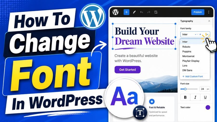
Change Fonts With The WordPress Site Editor
If your website uses a block theme, the Site Editor is usually the cleanest place to update fonts. From the dashboard, go to Appearance → Editor, open Styles, and look for Typography settings. From there, you can often change fonts for body text, headings, links, captions, and buttons without touching code.
This method is useful because it keeps your typography connected to the theme’s global style system. When you change the heading font globally, WordPress applies that choice across posts, pages, templates, and layout areas that use the same style rules. That means you avoid the messy result of changing one page manually while the rest of your website still uses old fonts.
You should also think about how popular digital products use typography to create familiarity. A clean interface often depends on readable spacing, neutral letterforms, and consistent text hierarchy, and a design reference like what font does Chatgpt use can help readers understand how software typography supports clarity. On your WordPress site, the goal is not to copy another brand blindly, but to learn how clear font choices make information easier to process.
After changing fonts in the Site Editor, preview several page types before publishing. Check a blog post, homepage section, menu, button, sidebar, and footer. This helps you catch oversized headings, tight line spacing, or button text that no longer fits.
Change Fonts With The WordPress Customizer
Classic WordPress themes often use the Customizer for font changes. You can usually find it by going to Appearance → Customize, then looking for Fonts, Typography, Global, Design, or Theme Options. The names vary because theme developers decide how to label their settings.
The Customizer is beginner-friendly because it usually shows a live preview before you publish changes. You can test a heading font, adjust body text, and see the page update in real time. If the design starts to feel too heavy, too playful, or too hard to read, you can change it again before visitors see the update.
Brand recognition also depends on consistent visual patterns, and large companies often choose fonts that match their shopping or browsing experience. A guide like what font does Amazon use shows how a major brand’s typography can feel simple, functional, and familiar to users. For your WordPress site, the lesson is to choose fonts that match the action you want readers to take, whether that action is reading, subscribing, booking, or buying.
If you do not see a font option in the Customizer, your theme may not support built-in typography controls. In that case, you can use a plugin, a page builder, or custom CSS. Avoid switching themes only for a font change unless your current theme is already limiting your full design.
Use Plugins When Theme Options Are Limited
A font plugin can help when your theme does not provide enough typography control. Many plugins let you connect Google Fonts, choose font families, assign styles to headings and paragraphs, and preview changes without editing CSS. This is often the easiest path for beginners who want more options than their theme provides.
Plugins are especially helpful when you want different font rules for headings, body text, navigation, and buttons. For example, you may want a bold font for H1 headings, a lighter font for paragraphs, and a clean uppercase style for call-to-action buttons. A plugin can make those changes easier to manage from one place.
Still, you should avoid installing multiple font plugins at the same time. Too many overlapping typography tools can create conflicts, slow down your site, or make it difficult to know which setting controls which text. Choose one reliable plugin, test it carefully, and remove anything you do not need.
What To Look For In A Font Plugin
Choose a plugin that is updated regularly, works with your theme, and gives you clear control over the elements you actually use. It should support global settings, previews, and safe fallbacks. A plugin that looks powerful but feels confusing can waste more time than it saves.
Change Fonts With Page Builders
If you use a page builder, it may have its own typography settings separate from WordPress core. Builders often allow you to change fonts for individual sections, templates, headings, buttons, forms, and mobile layouts. This gives you strong design control, especially if your site has landing pages or custom sales pages.
The benefit of a page builder is precision. You can style a hero headline differently from a blog post title, adjust font sizes for mobile screens, and create reusable design presets. This works well when you need a carefully designed page instead of a simple site-wide font change.
The risk is inconsistency if you change too many elements one by one. A page may look great on its own but feel disconnected from the rest of the website. To avoid that, create a small typography system first, then apply it across your pages instead of inventing new font rules every time.
Keep Builder Fonts Consistent
Use one primary font for body text and one secondary font for headings if you want a clean, professional look. You can use weight, size, and spacing to create variety instead of adding more font families. This keeps the site easier to read and faster to maintain.
Change Fonts With Custom CSS
Custom CSS gives you more control when theme settings and plugins do not solve the problem. You can usually add CSS through Appearance → Customize → Additional CSS or through a theme-supported custom CSS area. This method is useful when you want to target a specific element, such as post titles, menu links, buttons, or block quotes.
For example, you can use CSS to set a font family for all paragraphs or apply a different font weight to headings. You can also adjust line height, letter spacing, text transform, and font size. These details matter because a font can look good in a dropdown menu but feel uncomfortable when used across long paragraphs.
CSS is powerful, but it requires care. A small mistake can affect more elements than expected, especially if your selector is too broad. Before adding CSS, back up your site, copy your original code into a safe place, and test changes on desktop and mobile screens.
Use CSS For Specific Problems
Custom CSS works best when you need a focused fix. Use it to refine spacing, target a stubborn heading, or apply a font to a specific class. For full site-wide typography, theme settings or plugins are usually easier to manage.
Add Custom Fonts To WordPress
Custom fonts are useful when your brand uses a specific typeface that is not available in your theme or plugin. You can add custom fonts by uploading licensed font files and connecting them through plugin settings, theme tools, or CSS. Common web font formats include WOFF and WOFF2 because they are designed for browser use.
The important rule is to use fonts legally. Do not upload a random font file from your computer unless you have permission to use it on a website. Some fonts are free for personal use but require a license for business or commercial websites.
Once uploaded, a custom font needs to be assigned to the right elements. You may use it for headings only, while keeping body text in a highly readable system font. This is often a smart balance because it gives your brand personality without making long articles harder to read.
Use Fallback Fonts
Always include fallback fonts when possible. A fallback font appears if the custom font does not load for any reason. This protects your design from looking broken on slow connections or older browsers.
Choose The Best Font Pairing
A strong font pairing usually combines contrast with harmony. Your heading font can be more distinctive, while your body font should stay simple and easy to read. If both fonts are too decorative, the page feels noisy, but if both are too plain, the design may feel flat.
A safe approach is to pair a readable sans-serif body font with a slightly bolder heading font. You can also use one font family across the whole site and create contrast through size, weight, and spacing. This is often cleaner than forcing two unrelated fonts to work together.
Do not judge a font pairing from a single headline. Test it in a real article, a product section, a contact form, and a mobile menu. Fonts behave differently depending on length, screen size, color contrast, and spacing.
Keep Accessibility In Mind
Readable typography helps all visitors, including people using smaller screens or dealing with visual strain. Avoid tiny paragraph text, low contrast, and overly thin font weights. A beautiful font that makes reading harder is not a good design choice.
Improve Font Size, Spacing, And Weight
Changing the font family is only one part of typography. Font size, line height, font weight, and letter spacing can change the entire reading experience. A good font can still feel uncomfortable if the text is too small, too tight, or too heavy.
For body text, choose a size that feels comfortable on both desktop and mobile. Many websites use larger paragraph text than older designs because readers now scan pages quickly and often use phones. Line height should give each line enough breathing room without making paragraphs feel disconnected.
Heading weight also matters. A bold H2 can create strong structure, but an extremely heavy font may overwhelm the page if every heading looks loud. Use hierarchy carefully so readers can understand which ideas are most important.
Test On Real Content
Do not test fonts with placeholder text only. Use your actual blog posts, service pages, and product descriptions. Real content reveals spacing problems that short samples can hide.
Check Mobile Typography Before Publishing
Mobile typography deserves special attention because most readers will not experience your site on a large desktop screen first. A font that looks balanced on a laptop may look oversized, cramped, or awkward on a phone. Before publishing, preview your pages at multiple screen widths.
Look closely at headings, line breaks, buttons, menus, and form labels. Long words can wrap poorly, large headings can dominate the screen, and tight spacing can make paragraphs feel tiring. If your theme or builder allows responsive typography settings, adjust mobile font sizes separately.
You should also test tap-friendly areas around buttons and navigation links. Font changes can affect button width, menu height, and layout spacing. A small typography update can accidentally cause a mobile design problem if you publish without checking.
Watch Your Headings
Mobile headings often need smaller sizes than desktop headings. Keep them strong but not overwhelming. The goal is to help readers scan, not force them to scroll past giant text blocks.
Avoid Common WordPress Font Mistakes
One common mistake is using too many fonts on the same website. Multiple font families can make a page look chaotic and slow down loading. In most cases, one or two font families are enough for a professional WordPress design.
Another mistake is choosing style over readability. Script fonts, novelty fonts, and ultra-thin fonts may look interesting in a logo or graphic, but they often fail in menus, paragraphs, and buttons. If readers have to work hard to understand your content, the font is hurting the site.
A third mistake is changing fonts without checking the entire website. Your homepage may look fine while your blog archive, checkout page, or contact form looks broken. Always test key templates before you treat the project as finished.
Do Not Ignore Performance
Fonts can affect loading speed, especially if you load many weights and styles. Use only the weights you need. A simple typography setup is usually faster and easier to manage.
Create A Simple Font System
A font system gives you rules you can repeat across the site. Instead of deciding fonts from scratch on every page, define your body font, heading font, button style, link style, and caption style once. This makes your website easier to update and more consistent for visitors.
Your system does not need to be complicated. You can decide that all H1 headings use one size and weight, all H2 headings use a slightly smaller size, and all body paragraphs use a clear readable font. Then you can apply those rules through the Site Editor, Customizer, plugin, builder, or CSS.
A simple system also helps when your website grows. New blog posts, landing pages, and service pages will feel connected because they follow the same visual language. That consistency makes your site feel more professional without adding extra design work.
Document Your Choices
Write down your selected fonts, sizes, weights, and usage rules. This is useful if you work with a designer, developer, or content editor later. It also prevents random changes that weaken your brand over time.
Final Checklist Before You Publish Font Changes
Before publishing, review your font changes like a visitor would. Read a full paragraph, scan the headings, click through the menu, and check buttons, forms, captions, and footer text. If any part feels difficult to read, adjust the typography before making it live.
You should also compare your design on desktop, tablet, and mobile. Make sure headings do not break awkwardly, body text has enough spacing, and buttons still look clean. If your custom font loads slowly, reduce unnecessary weights or consider using a faster fallback.
Finally, keep your typography aligned with your website’s purpose. A personal blog can feel warm and relaxed, but a business website should usually lean toward clarity and trust. Good font choices make your content easier to understand, and that is the real goal of changing fonts in WordPress.
Quick Publishing Checks
Confirm that your font works on all major page types. Check readability in light and dark sections if your site uses both. Save your settings only after the design feels consistent everywhere.
Conclusion
How to change font in WordPress becomes much easier when you understand which method fits your website. Start with your theme settings, because the Site Editor or Customizer often gives you enough control for headings, paragraphs, buttons, and links. If your theme feels limited, use a trusted plugin, page builder, or custom CSS to get more precise typography control without rebuilding your whole site.
Your font should make your website easier to read, easier to trust, and easier to remember. Choose a small font system, test it on real content, and check mobile layouts before publishing. When typography supports your message instead of distracting from it, your WordPress site feels cleaner, faster, and more professional.