What is the biggest font is a simple question with two useful answers: the biggest size you can type and the font that looks biggest on the page. In Google Docs, the largest commonly used font-size value is 400, but a wide display font can look larger than a narrow font at the same number.
That difference matters when you are making posters, signs, classroom sheets, flyers, title pages, or bold headings.
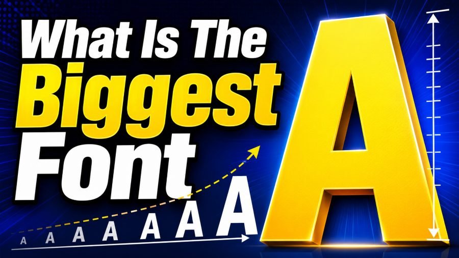
This guide explains the real answer in plain English, shows why some fonts appear bigger, and helps you choose large text that stays readable.
What Is The Biggest Font In Google Docs?
The biggest font size in Google Docs is commonly understood as 400, which you can type directly into the font-size box when the dropdown does not show the number you want. This does not mean every font at 400 looks the same, because font design changes how much space each letter uses on the page.
When you ask what is the biggest font, separate size from appearance because both answers help in different situations. A 400-size font is the maximum size answer, while a font with thick, wide letters is the visual answer that often matters more for posters and display text.
If you want to test large lettering outside a document before choosing a style, a font tool can help you generate unique and stunning fonts for your projects and compare how different letter shapes feel before you commit to a design.
The most useful approach is to choose the biggest font based on purpose rather than chasing the highest number. If you need a one-page sign, 250 to 400 can work, but if you need a heading above body text, 36 to 72 usually looks more professional.
Biggest Font Size Vs Biggest Looking Font
The biggest font size is the numerical setting, while the biggest-looking font is the one that takes up the most visible space. That difference explains why two fonts can be set to 72, yet one looks compact while the other looks loud, wide, and poster-ready.
A font looks bigger when it has broad letters, heavy strokes, generous spacing, and a tall x-height. X-height means the height of lowercase letters such as x, a, e, and o, and it strongly affects how large a font feels to the eye.
Display fonts often look larger than body fonts because they were designed for titles, logos, signs, and attention-grabbing words. Fonts like Diplomata SC, Diplomata, Notable, Rubik Mono One, Press Start 2P, and Seymour One tend to feel big because their letters are wide, dense, and visually forceful.
Why Some Fonts Look Larger At The Same Size
Fonts look larger at the same size because typography is not measured only by the height of the full letter box. Each font has its own proportions, including letter width, stroke thickness, internal spacing, ascenders, descenders, and x-height.
For example, a narrow font may look elegant at 72, but it may not fill much horizontal space. A wide font at the same size can stretch across the page, making the text look bigger even when the font-size number has not changed.
This is why visual testing matters before you finalize a document. If you compare brand and interface fonts, you can see how design choices create different impressions, and a resource like what font does Chatgpt use helps explain how a readable interface font can feel modern, clean, and calm instead of oversized or decorative.
Best Large Fonts For Posters And Headings
The best large fonts for posters and headings are fonts that create impact without destroying readability. Montserrat, Oswald, Roboto, Open Sans, Arial, Raleway, and Merriweather are strong options because they remain clear when enlarged.
Montserrat works well for modern titles because it has clean geometric shapes and a confident structure. Oswald is useful when you need tall letters that fit into limited width, while Roboto and Open Sans are excellent when readability matters more than decoration.
Large fonts also influence brand personality, especially when the text appears on social media graphics, ads, or visual templates. If you study visual identity examples such as what is the Instagram font, you can see how font choice supports a recognizable look without relying only on size.
How To Set The Biggest Font Size In Google Docs
To set a very large font in Google Docs, highlight your text and click the font-size box in the toolbar. You can type a custom number directly into that box, then press Enter to apply it to the selected text.
If you do not see the font you want, open the font menu and choose More Fonts. Search for a font, select it, add it to your available fonts, and return to your document to apply it.
Google Docs may shift the text dramatically when you use very large sizes, so expect to adjust margins, line spacing, page orientation, and alignment. A 300 or 400 font can push letters onto separate pages, especially when the word is long or the font is wide.
When Should You Use A Very Large Font?
You should use a very large font when the message needs to be seen quickly from a distance. Common examples include classroom signs, event posters, garage-sale notices, stage labels, presentation title slides, and simple directions.
Large text is also helpful when the reader may not be close to the page or screen. If someone is walking past a bulletin board, viewing a slide from the back row, or reading a printed notice on a wall, bigger type improves recognition.
However, very large fonts lose their value when the message becomes too long. A full paragraph in 100-size text feels awkward because the reader has to work harder to follow the line breaks and meaning.
When Should You Avoid The Biggest Font?
You should avoid the biggest font when clarity, professionalism, or reading comfort matters more than visual impact. Legal documents, resumes, reports, proposals, essays, manuals, and long guides usually need balanced typography rather than extreme size.
The biggest font can also make a document look less credible when used without purpose. Oversized letters may feel playful or urgent, which is not always the tone you want for formal or technical content.
Another issue is space. When a font is too large, it reduces the amount of information that fits on a page and can create awkward breaks between letters, words, or sections.
Google Docs Vs Microsoft Word Font Limits
Google Docs and Microsoft Word handle large font sizes differently. Google Docs is widely used for online writing and collaboration, while Word gives users more traditional desktop-publishing control.
In Google Docs, users commonly refer to 400 as the maximum large font size. In Microsoft Word, users can type much higher custom values, and Word is often cited as allowing font sizes up to 1638 points.
That does not automatically make Word better for every large-font project. Google Docs is easier for sharing, commenting, real-time editing, and quick access across devices.
How To Choose The Biggest Font For Readability
Readability should guide every font decision, especially when the letters become very large. A huge font still fails if the reader has to slow down, guess the words, or fight the layout.
To choose the biggest readable font, start with the viewing distance and the message length. The farther away the reader is, the larger the font should be, but the shorter the message should become.
A classroom wall sign can use one huge word or phrase because the goal is fast recognition. A document heading should be smaller because it has to fit naturally with paragraphs, lists, and page structure.
Choose clean fonts when the message must be understood quickly. Arial, Roboto, Open Sans, Montserrat, and Noto Sans are practical because they are simple, familiar, and easy to scan.
Common Mistakes With Huge Fonts
One common mistake is using the maximum size just because it is available. The largest setting can create drama, but it can also make your document look unfinished when the letters no longer fit neatly.
Another mistake is mixing too many large fonts in one design. When every heading has a different style, the reader has no clear path through the content.
People also forget line spacing when enlarging text. Very large letters need enough room above and below, or the text can look cramped even when the page has plenty of empty space.
Practical Font Size Ranges To Use
Start with a practical range instead of jumping straight to the largest number. This keeps your design useful for the person reading it, not just impressive on your screen.
For normal body text, many documents use around 10 to 12 points, depending on the font and purpose. This range works well for essays, reports, letters, and standard online documents.
For headings, 16 to 30 points often gives enough emphasis without taking over the page. For title pages, posters, and classroom materials, you may move into 48, 72, 120, or much larger sizes.
When you reach 200 or above, you are no longer designing ordinary document text. You are creating display lettering, which means spacing, page orientation, and word length become more important.
Final Checklist Before You Use A Giant Font
A quick checklist helps you avoid the most common layout problems before you share or print the document. It also gives you a simple way to judge whether the biggest font is helping the message or hurting it.
Before using a giant font, check whether the text fits on the page without awkward cropping. If letters are cut off or pushed onto extra pages, reduce the size or change the page orientation.
Next, check whether the font matches the purpose. A bold display font may be perfect for a fun announcement, while a clean sans-serif font may be better for instructions, school materials, or workplace signs.
You should also test how the font looks in print preview. A design that looks good at 80 percent zoom can behave differently when printed at full page size.
Conclusion
What is the biggest font depends on whether you mean the highest size setting or the largest visual appearance, and that distinction helps you make smarter design choices. In Google Docs, 400 is the practical maximum size many users look for, but fonts such as wide display styles can appear much larger than cleaner body fonts at the same setting.
For most projects, the best choice is not the biggest font available but the biggest font that still looks clear, balanced, and useful. Use very large text for posters, signs, title pages, and short messages that need quick attention. Choose readable fonts like Arial, Roboto, Open Sans, Montserrat, and Oswald when clarity matters. Before finishing, test the layout, preview the print version, and make sure the message can be understood instantly by the people reading it.